Visualisation information
- Category: Interactive Map & Charts
- URL: Chart: The Share Prices Between Jun 2006 and Dec 2010
- URL: Chart: The Unemployment Rate Comparison Between Australia and Major Economics
- URL: Map: Australia Personal Bankruptcy Rate in 2007-2008 Fiscal Year
- URL: Chart: The Total Unemployment Rate in Australia Major Cities in Oct 2009
Australia Visualisation
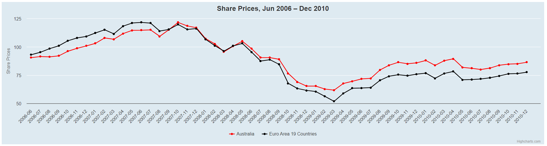
1. Interactive chart to describe the share prices between
Jun 2006 and Dec 2010 in Australia.
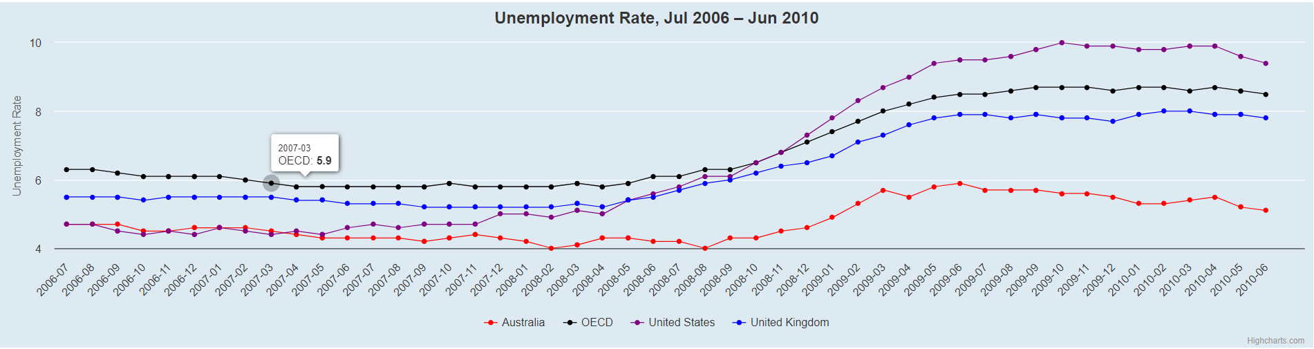
2. Interactive chart to compare unemployment rate between Australia and other major economics.
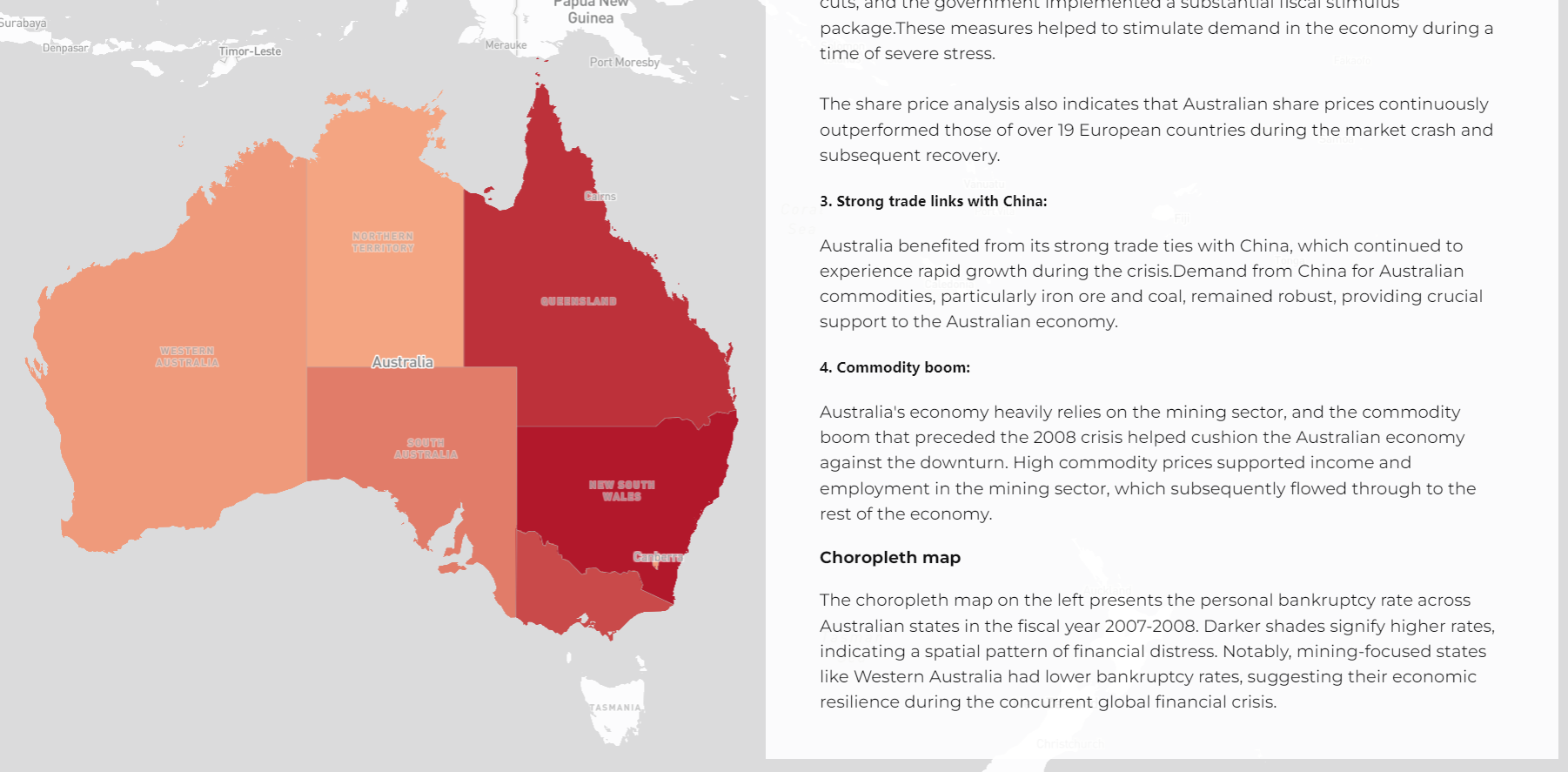
3. The choropleth map to describe the state level personal bankruptcy rate in Australia in
2007-2008 fiscal year.
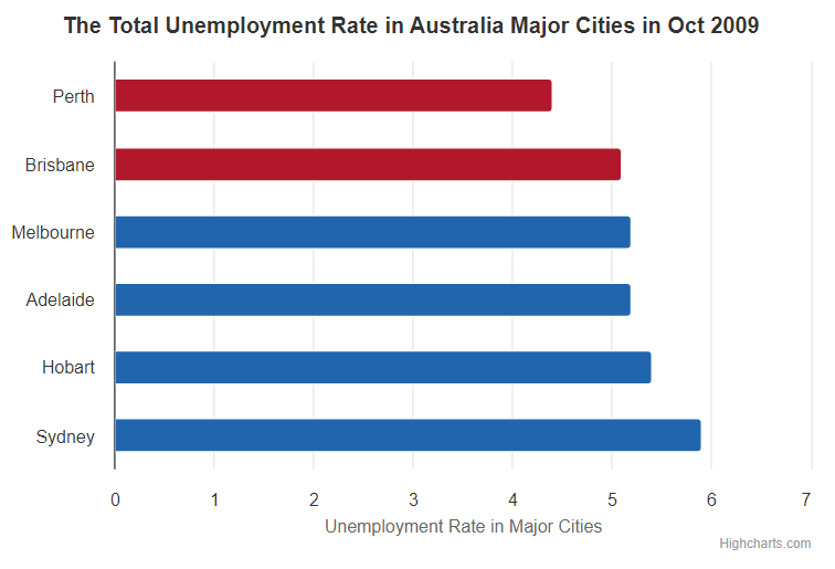
4. Interactive chart to describe unemployment rate in Australia's major cities in 2009 with highlight
details.