Visualisation information
- Category: Interactive Map & Charts
- URL: The Great Recession Timeline Chart
- URL: The United States Homeownership and Vacancy Rate 2003-2023
- URL: Top 10 US Housing Foreclosure number 2009
- URL: The United States Socio-Economic Situation 2009
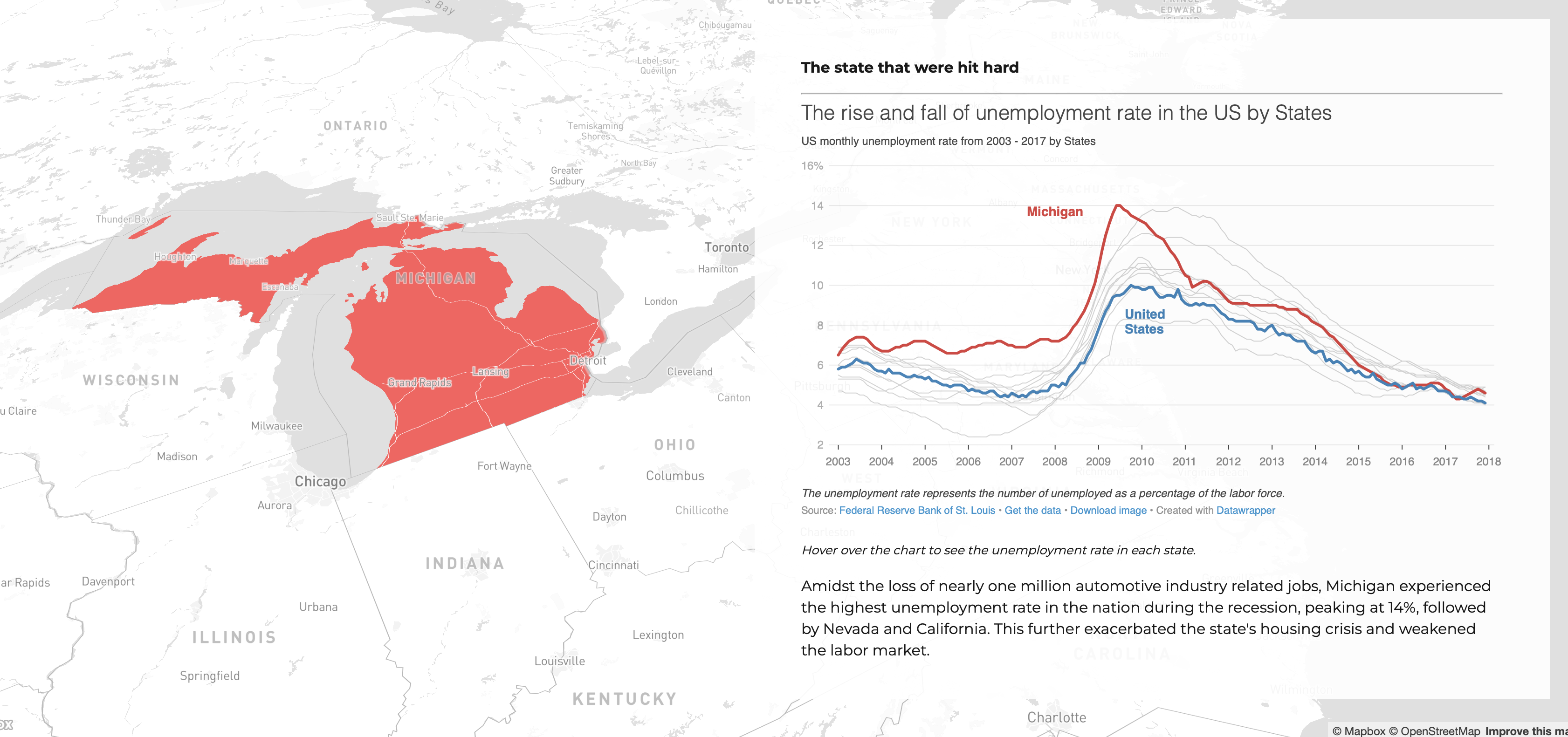
- URL: The rise and fall of unemployment rate in the US by States 2003-2017
USA Visualisation
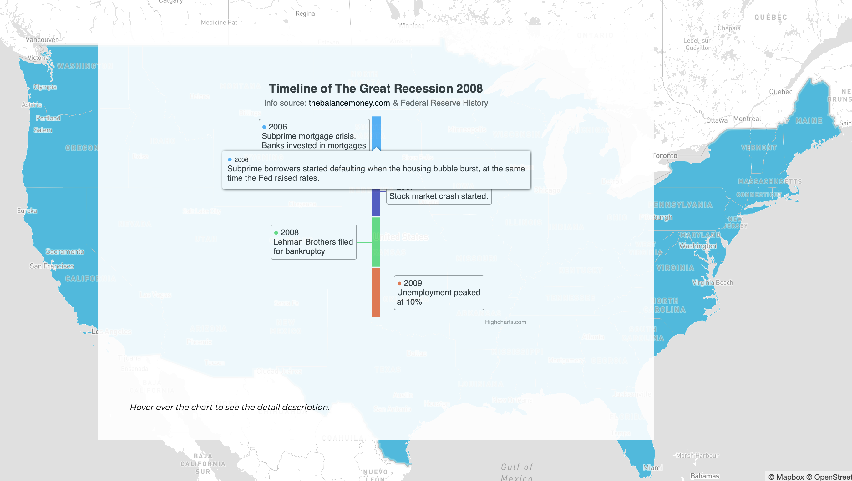
1. Interactive timeline chart to describe the timeline for the great recession with pop up description.
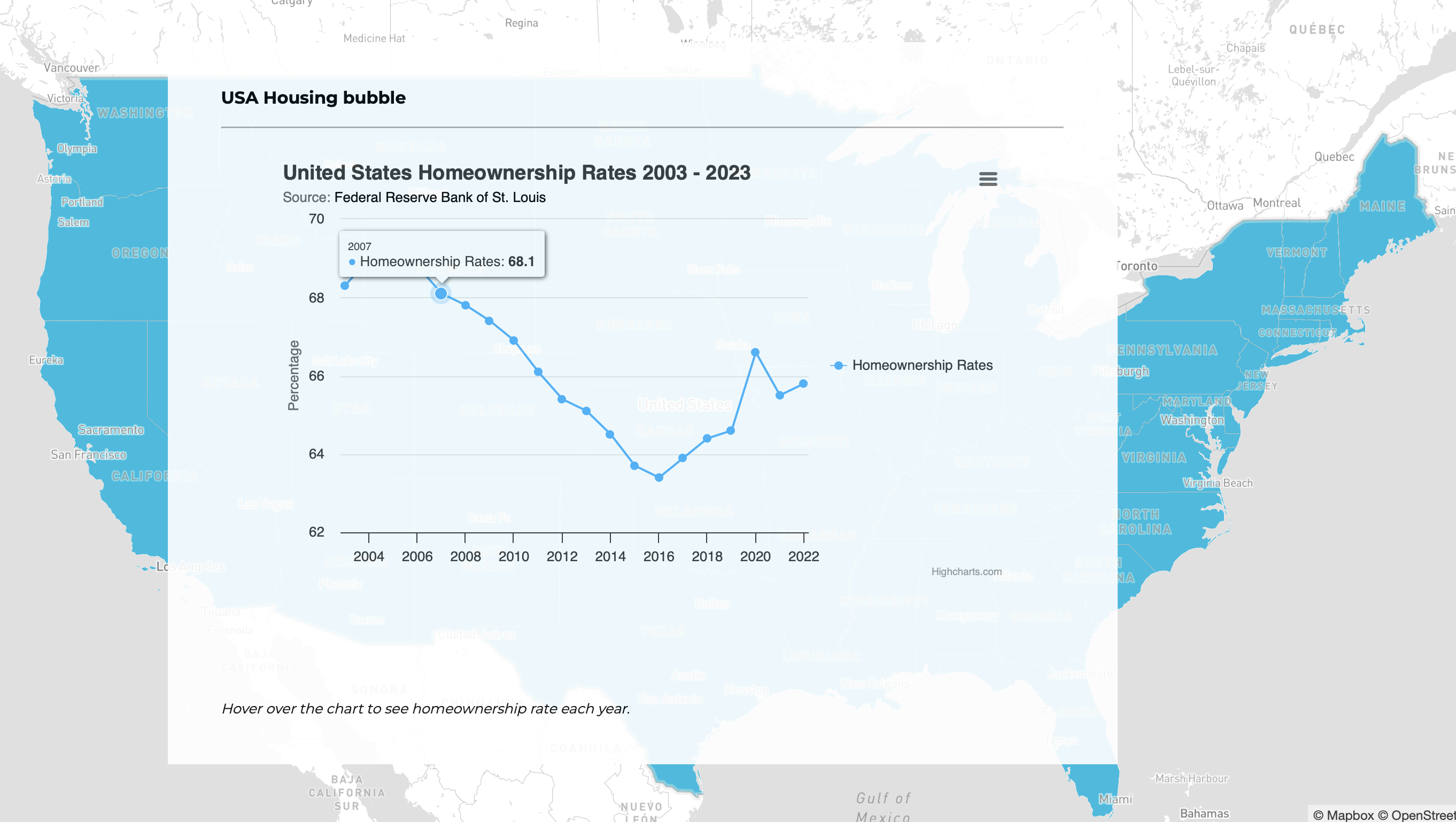
2. Interactive line chart to describe homeownership in the US from 2003-2023 with highlight detail and line selection.
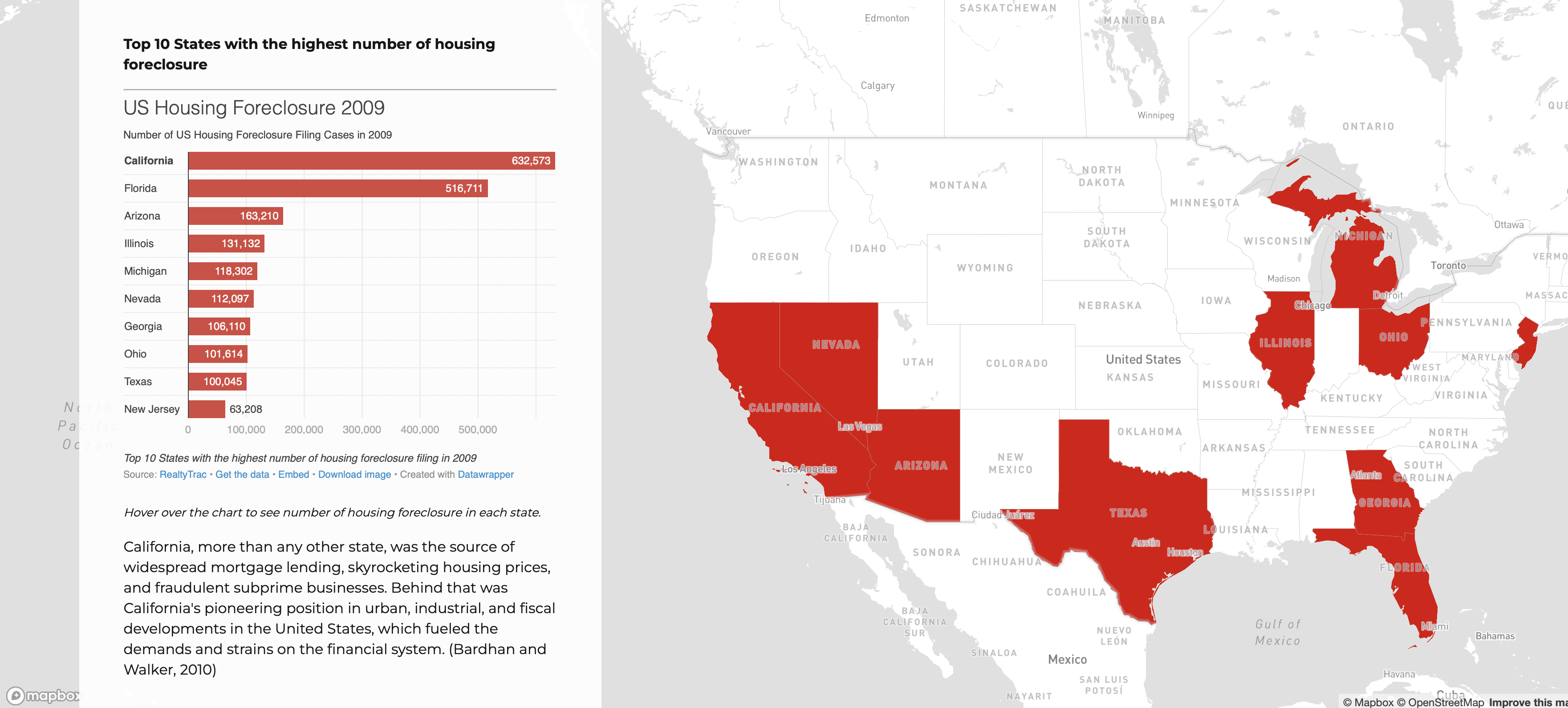
3. Interactive bar chart to describe the top 10 US Housing Foreclosure number by States in 2009 with highlight and hover over.
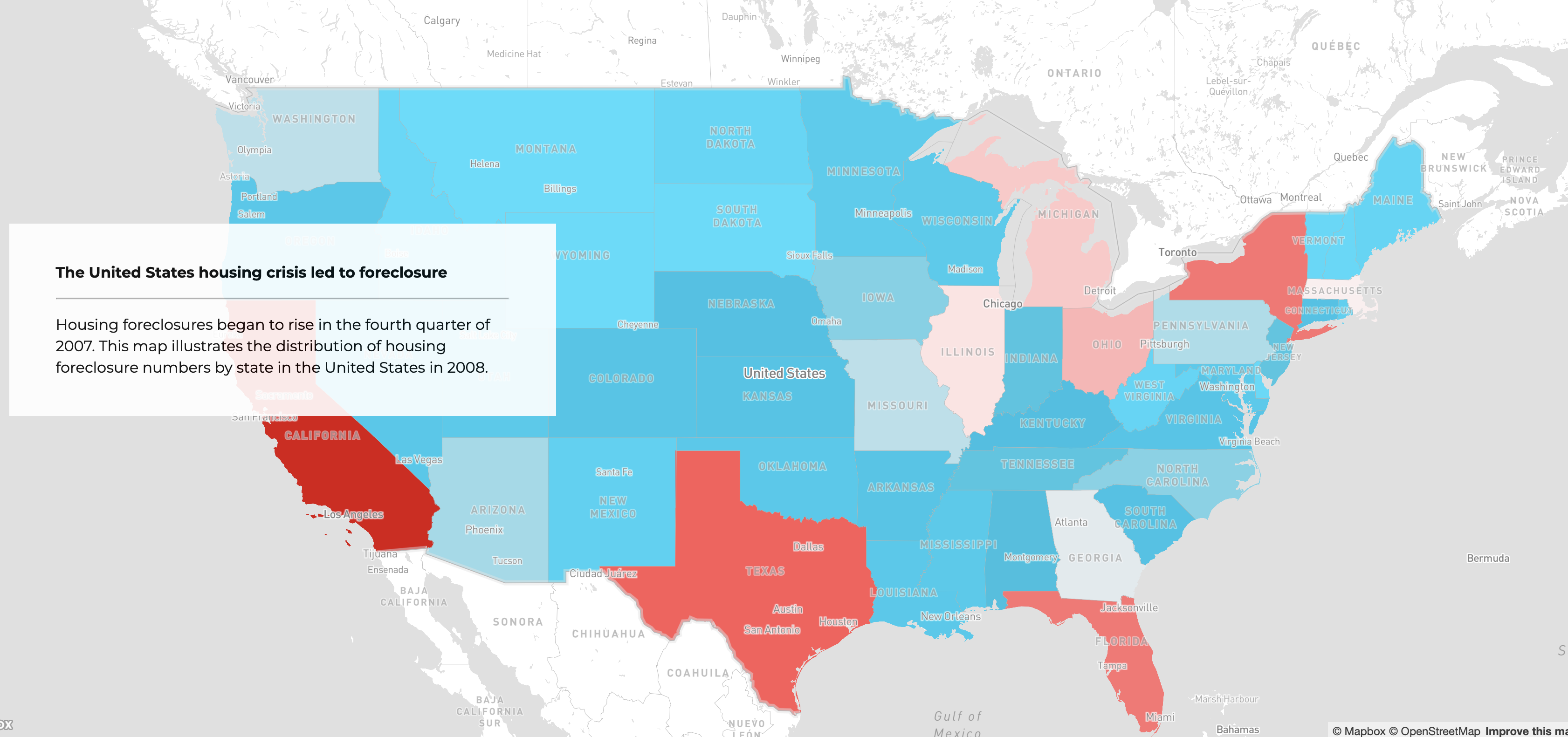
4. Interactive map of socio-economic situation in the US at county level after the stock market crash (2009). You can select the indicators and fly to impacted states.
5. Interactive line chart to illustrate the US unemployment rate overtime by States 2003-2017.